Currently, over half a million people are experiencing homelessness in the United States. Two-thirds are individuals, one-third are families and 18 percent are children. California leads the nation with over 150,000 — approximately one-fifth of the total U.S. homeless population.
Zoning rules and local protests have added to a growing housing deficit and California is among the worst states in providing affordable homes — only 23 per 100 extremely low-income renters. Since 2008, JAG Interiors has partnered with builder clients who specialize in developing Affordable and Supportive communities, and shares their vision of ending the homeless crisis in our state.
JAG founder and president, Jamie General, has become an expert in this rewarding segment and the JAG team has followed her lead in designing interiors that are functional, sustainable and welcoming, for low-income residents who have special needs, including seniors, veterans and previously unhoused individuals and families.
TRAUMA-INFORMED DESIGN
Due to the high incidence of traumatic exposure among those who have suffered from homelessness, understanding the impact of trauma is essential in designing and building housing for these residents. Our journey has included becoming trauma-informed — so that we can respond empathically to the needs of trauma survivors — and we have identified several key ingredients in providing shelter from the storm.
1. SAFETY AND SECURITY COME FIRST
Design Resources for Homelessness reports that the fundamental need sought by people experiencing trauma and homelessness is “a sense of confidence and trust in the world.” Spaces that exude optimism, calmness and respect can support each individual’s sense of dignity and self as they exit homelessness.
2. WHO, WHAT, WHERE, WHEN, WHY — AND HOW MUCH?
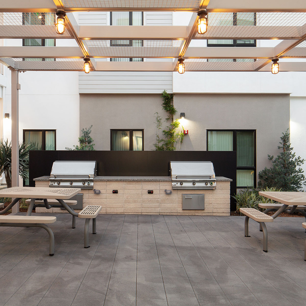
Understanding how common areas will be accessed and utilized is crucial, including traffic patterns and social purposes. Cost is always a major factor, so extreme care must be taken to create enjoyable and usable environments without breaking the budget.
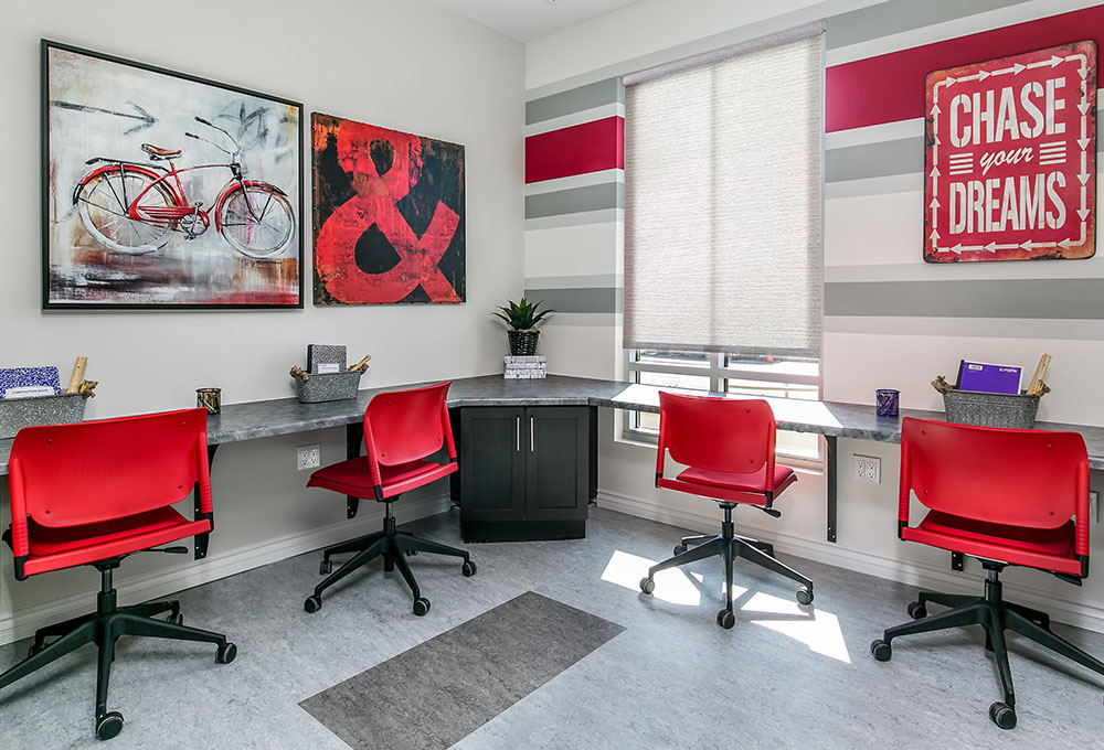
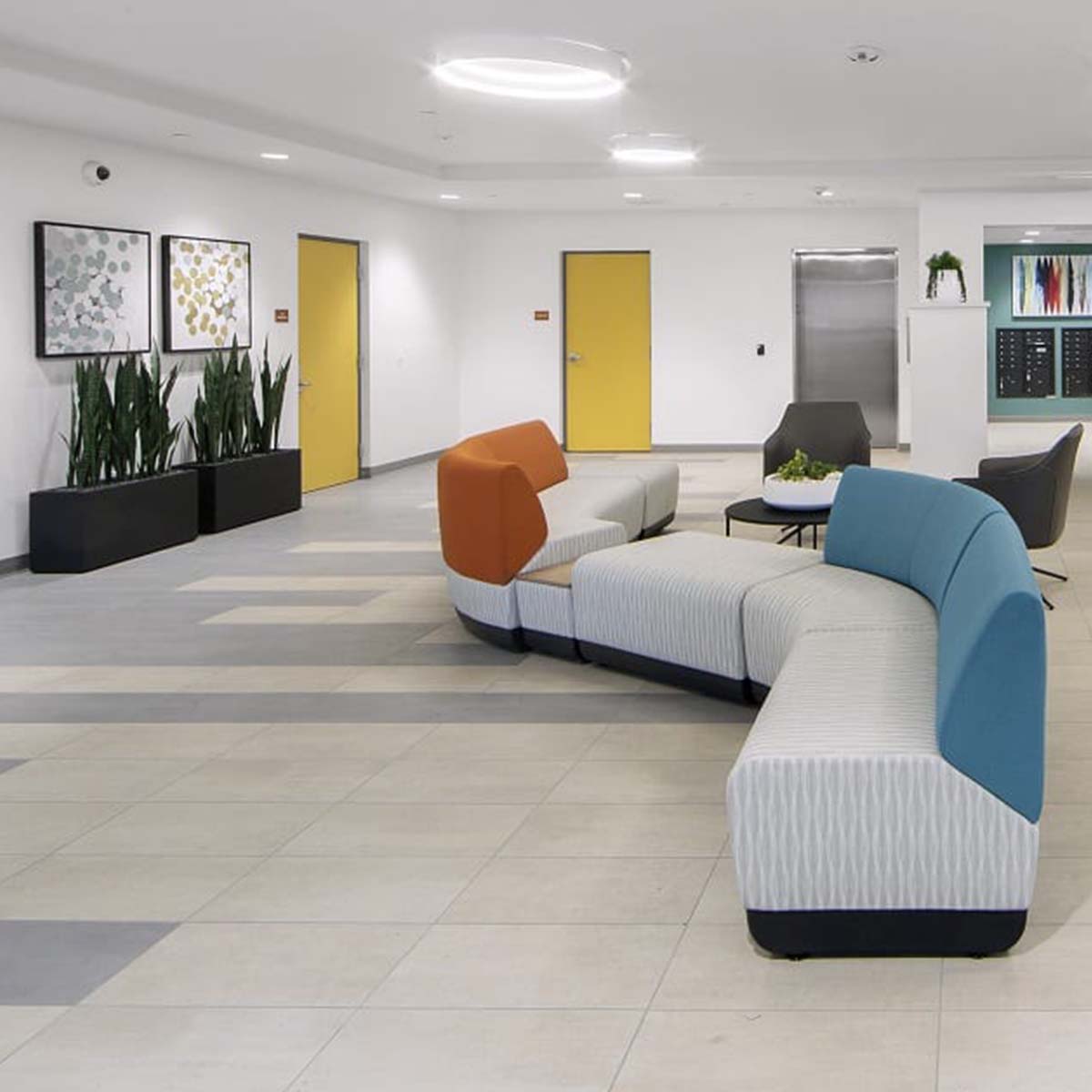
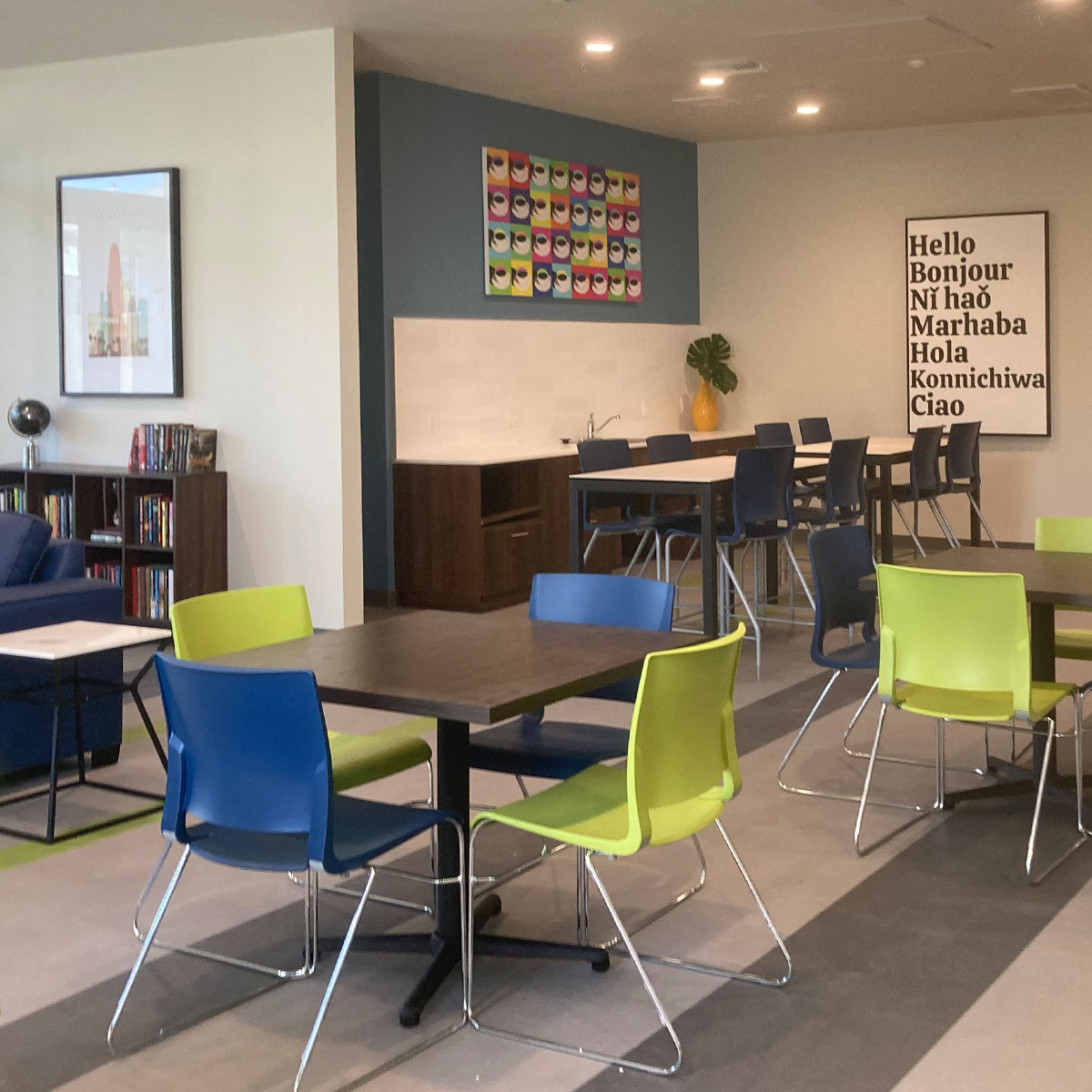
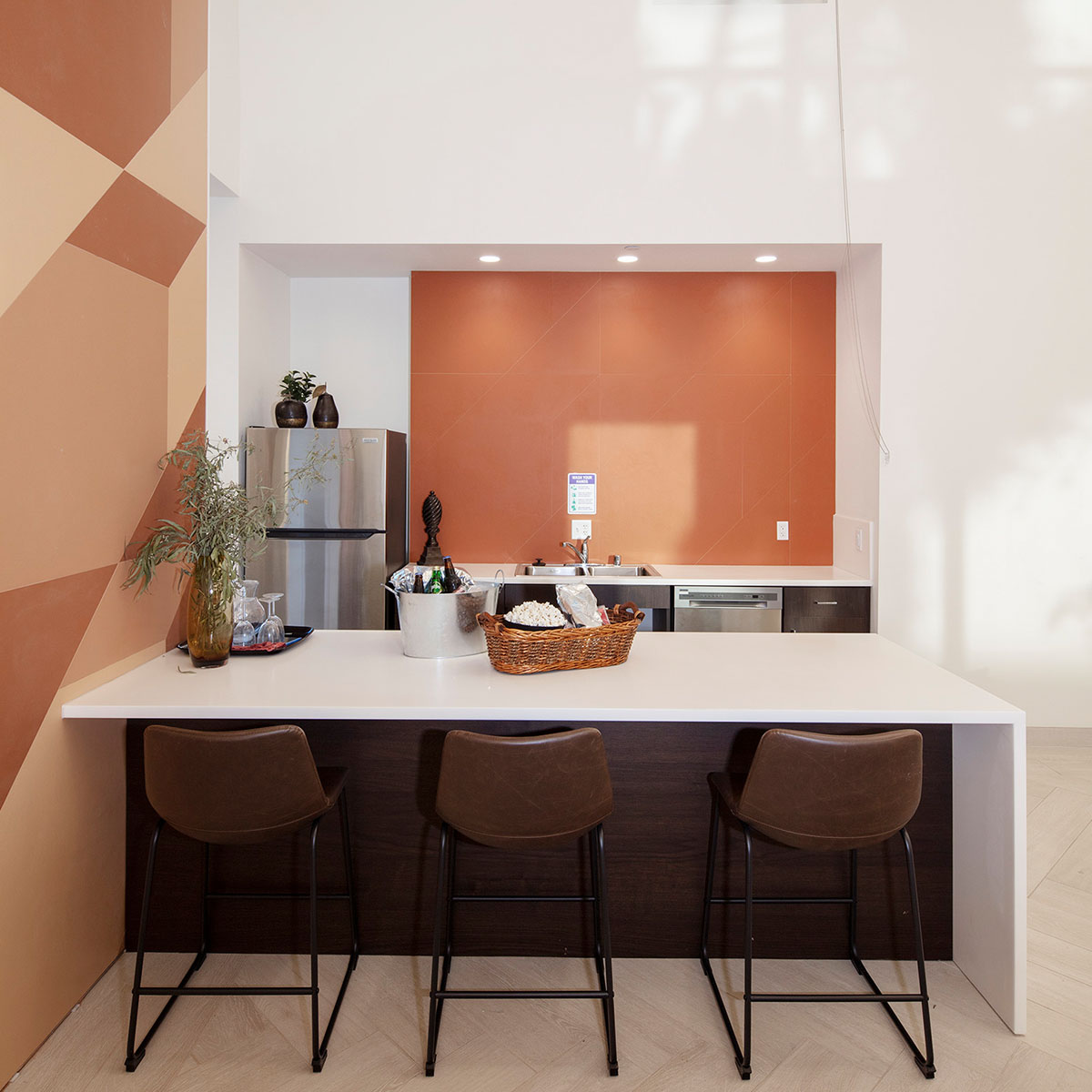
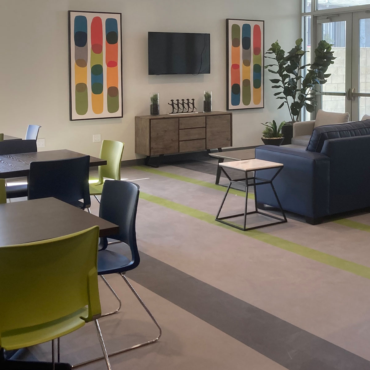
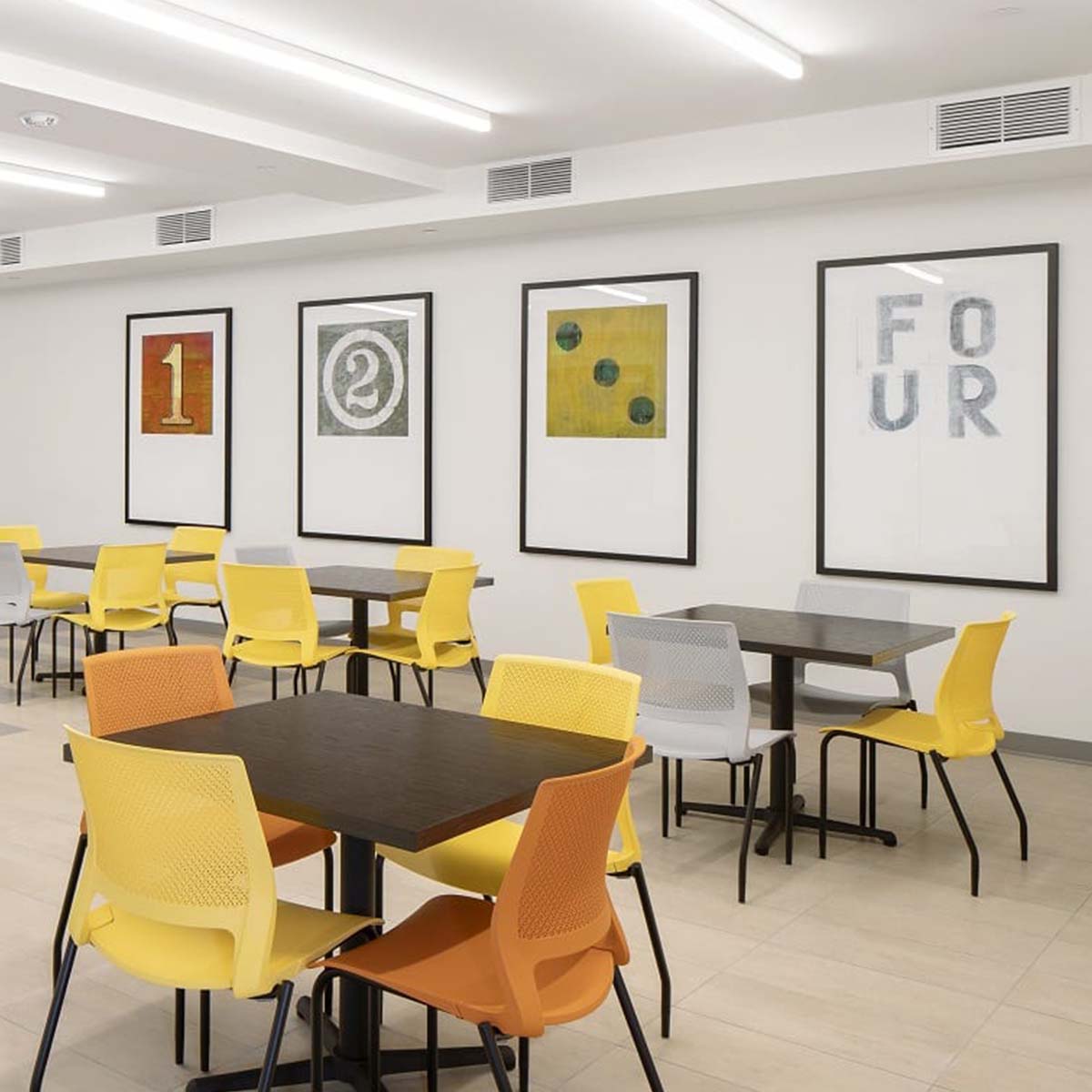
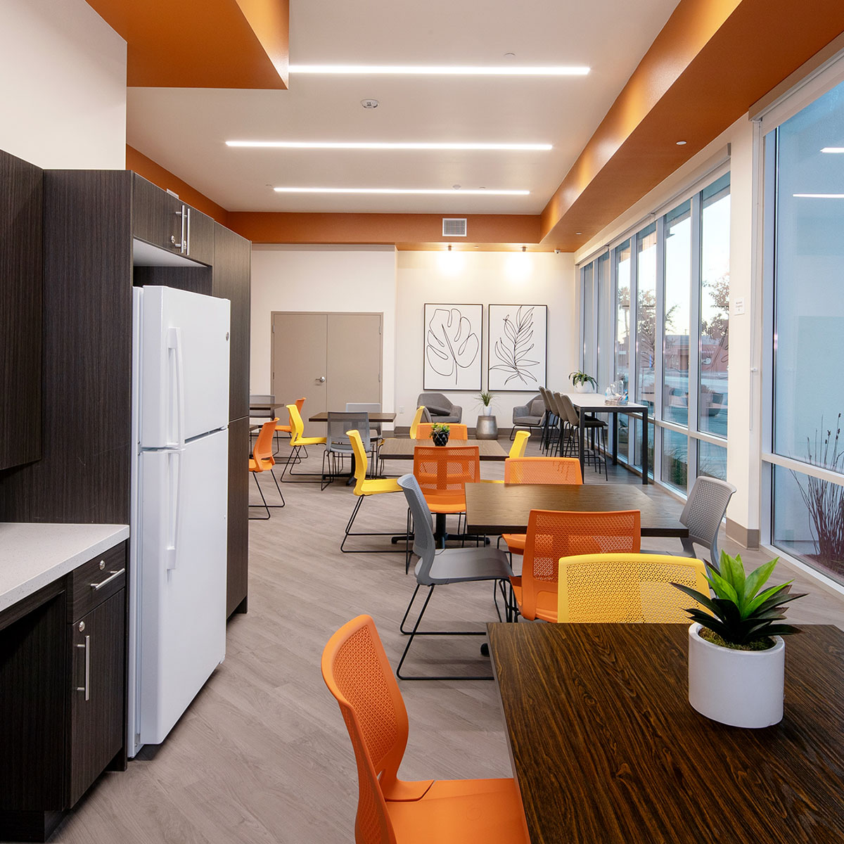
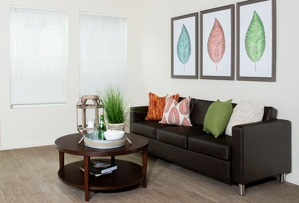
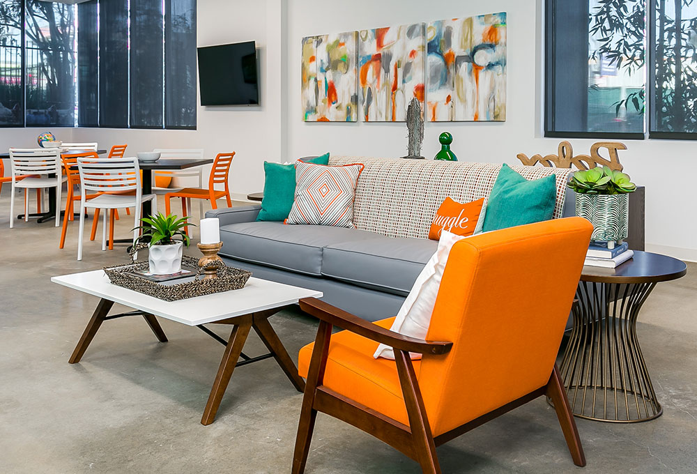
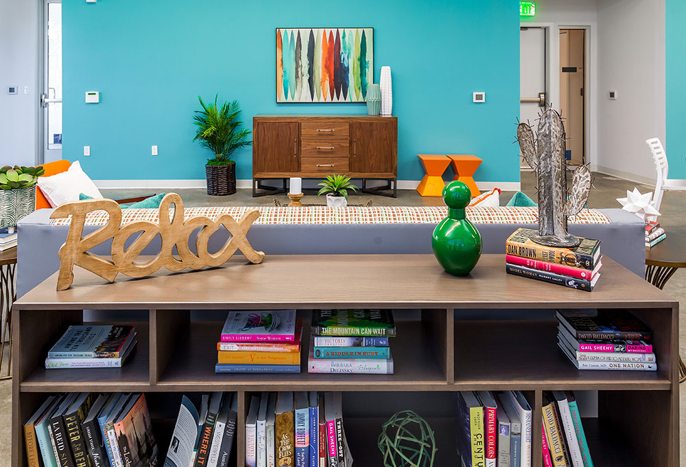
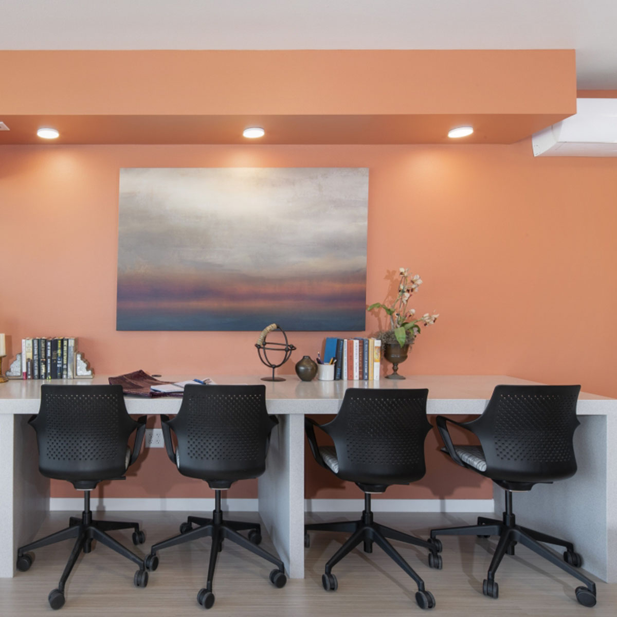
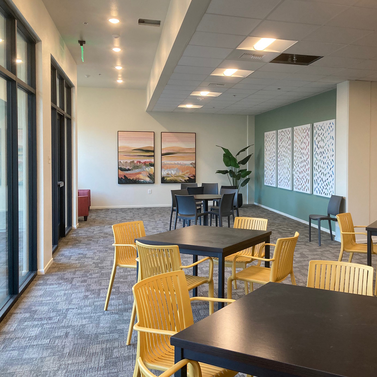
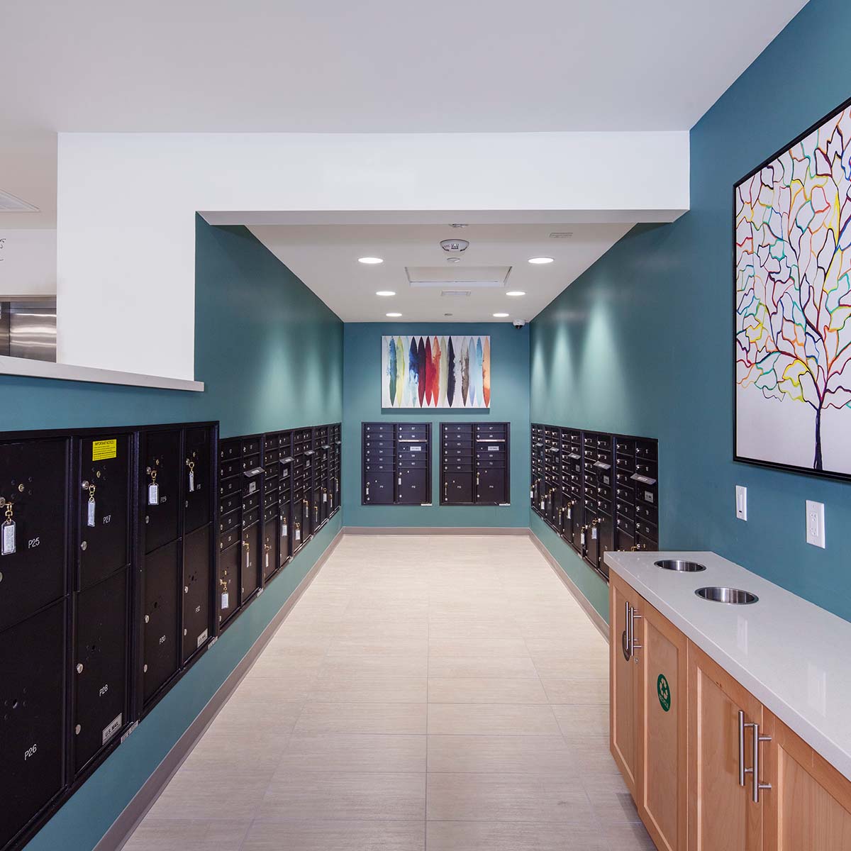
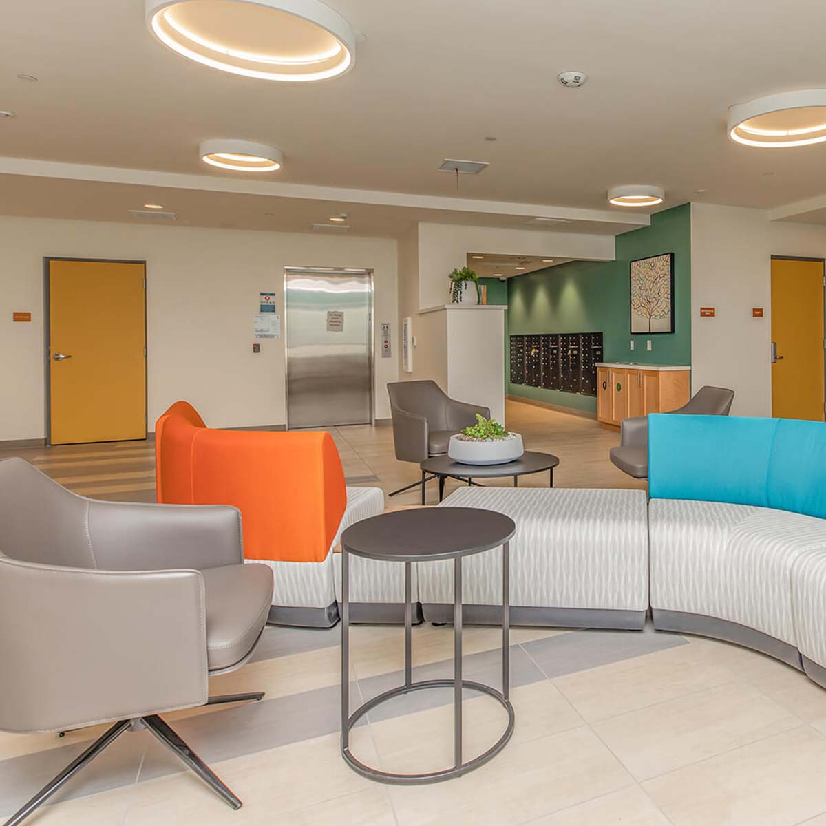
- Furnishings and Accessories: Durability and functionality are paramount in high-traffic areas, but style and comfort are equally important. It’s a balancing act!
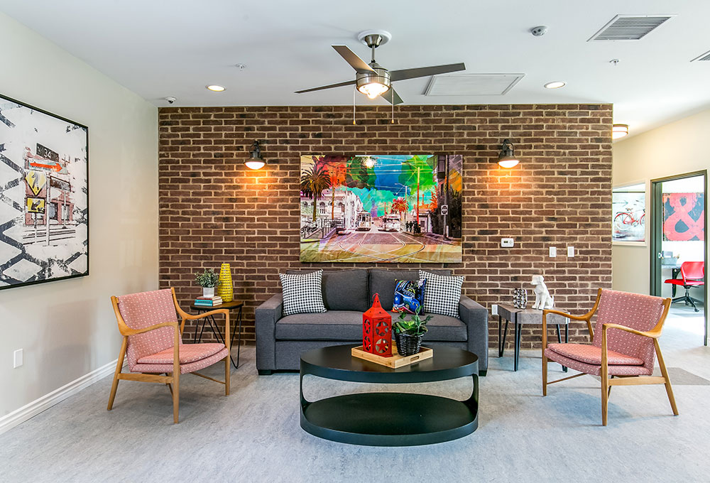
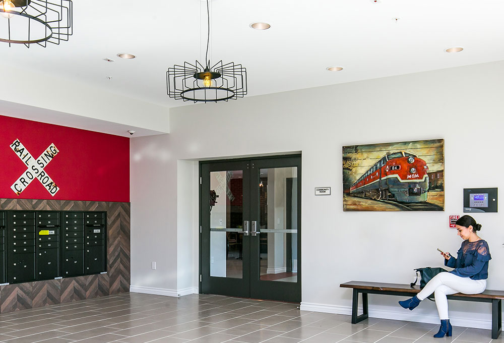
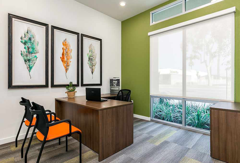
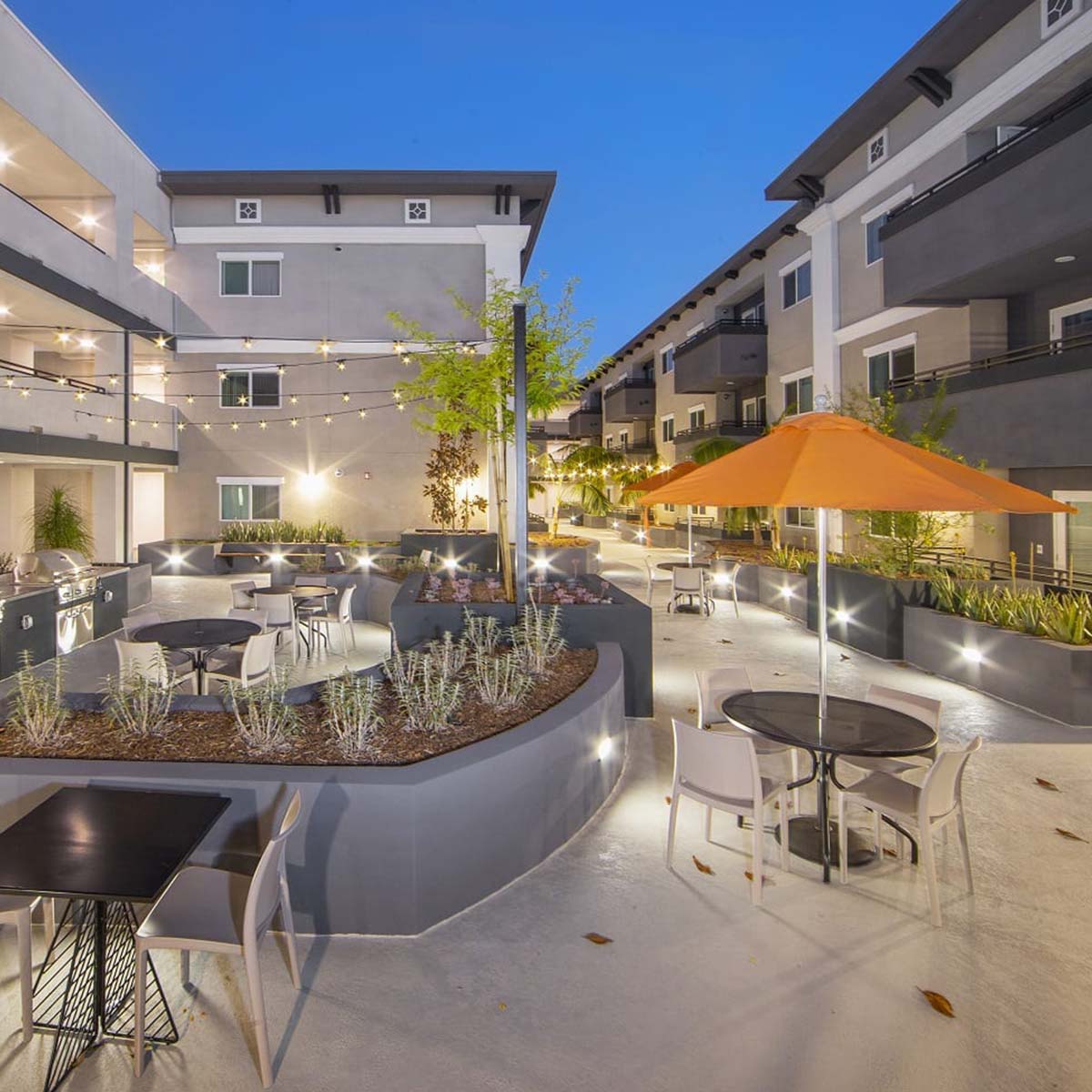
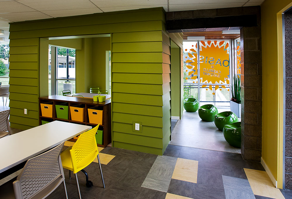
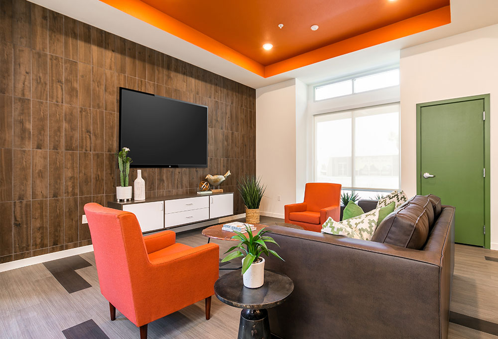
- Lighting: Natural light is always the most calming and restorative, but where it’s not an option, warm tones are best for fostering comfort and relaxation. We recommend at least three lighting sources to add interest and create a welcoming atmosphere, e.g., overhead lighting, lamps and windows. To provide a sense of safety for residents who have often lived in fear, entries and common areas should always be well illuminated.
Tip: Intimate pools of light from sconces and hanging fixtures add interest and make people feel at home.

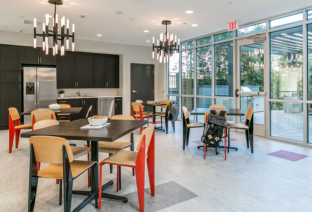
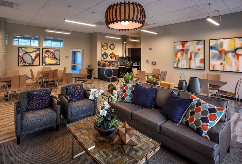
- Flooring: Often the first impression of a space, choices include hardwood, stone, ceramic, porcelain, concrete, carpet, vinyl and tile — each with their own pros and cons. With the budgetary constraints for Affordable communities, real stone and hardwood are seldom possible, so we are fortunate to have an abundance of faux stone and wood choices in luxury vinyl tile.
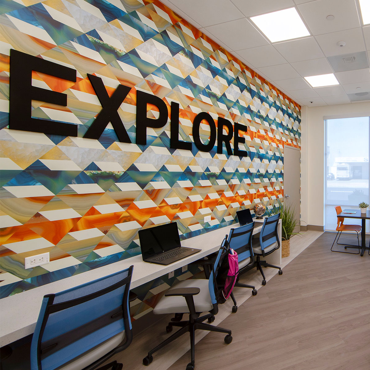
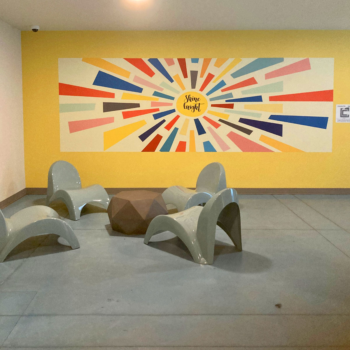
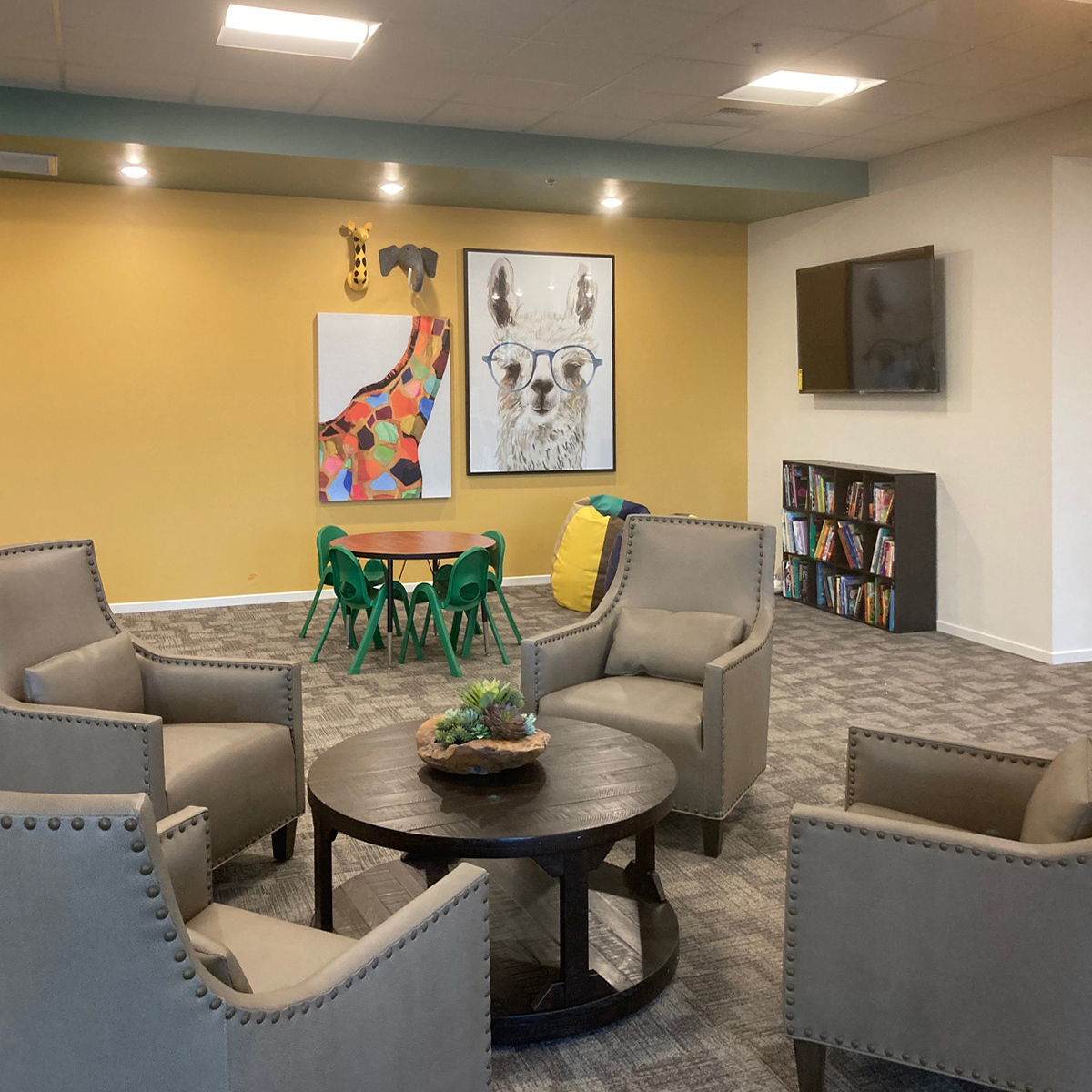
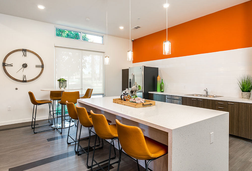
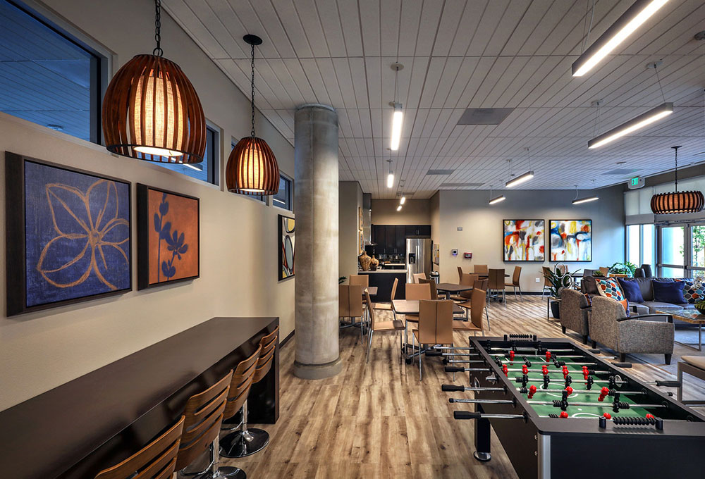
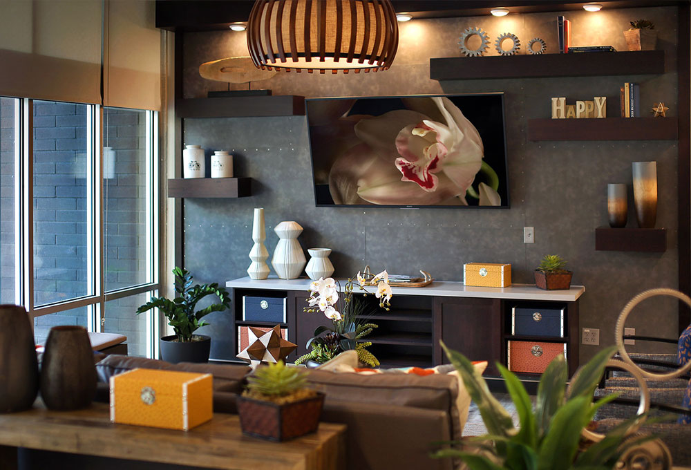
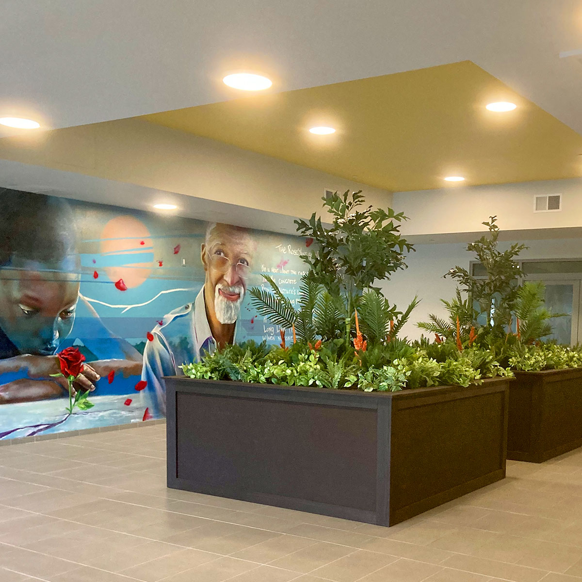
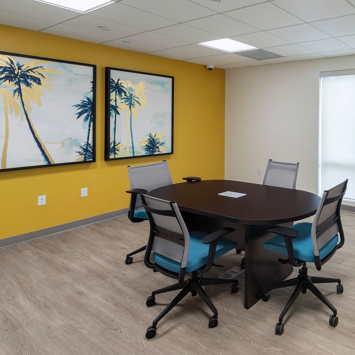
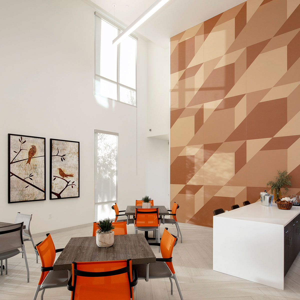
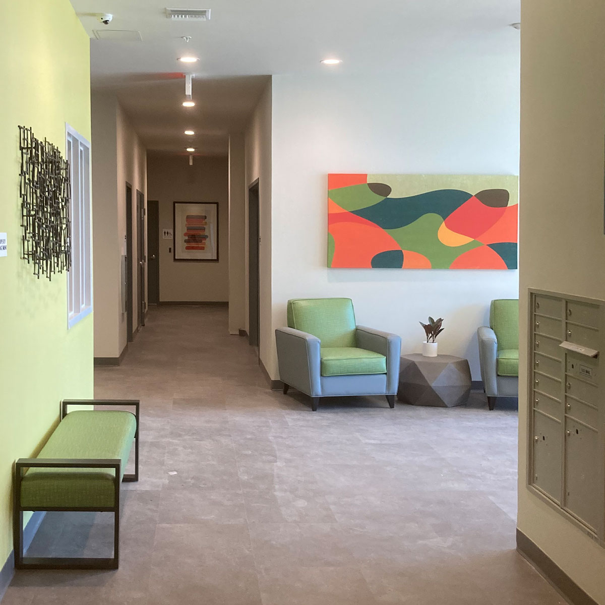
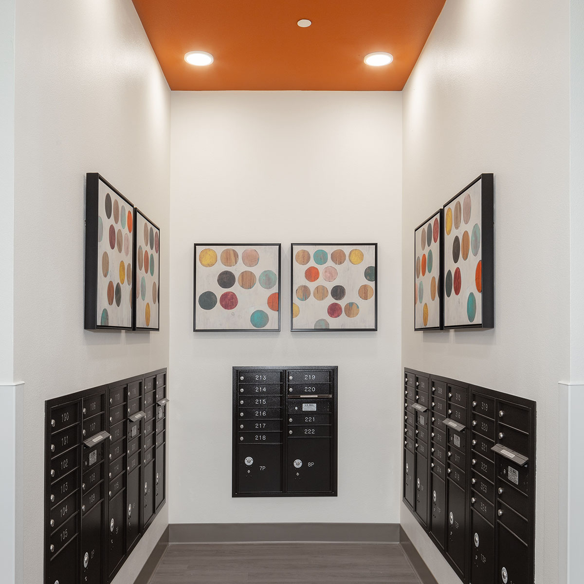
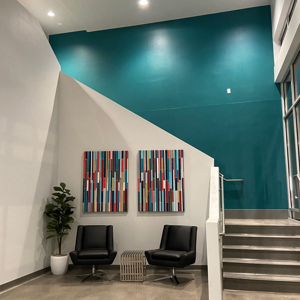
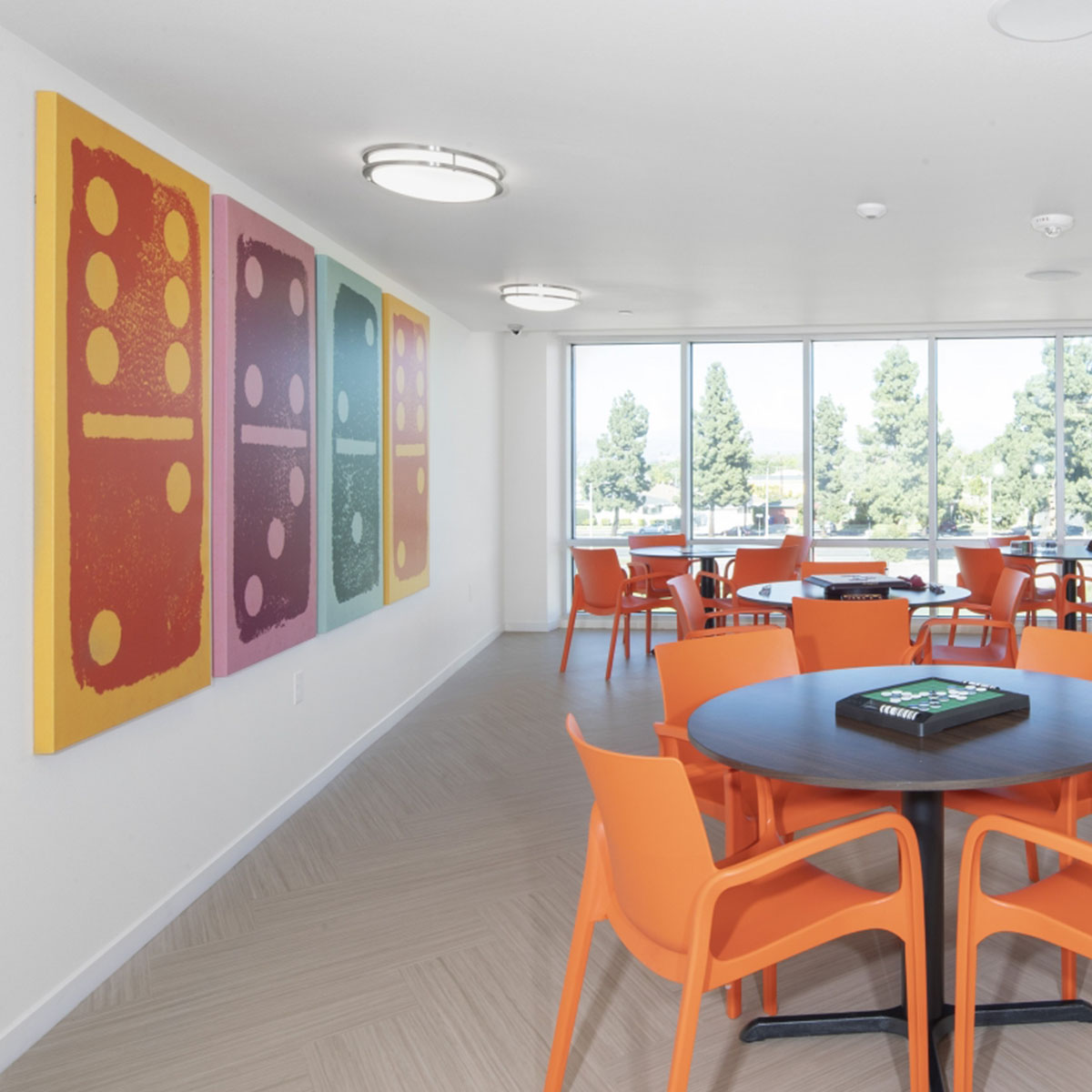
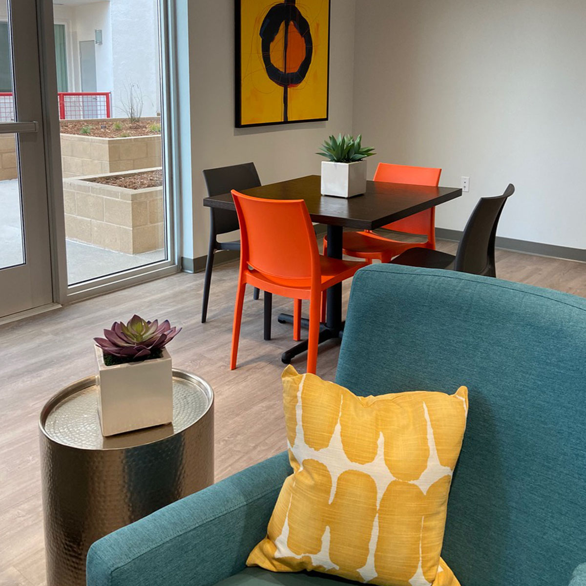
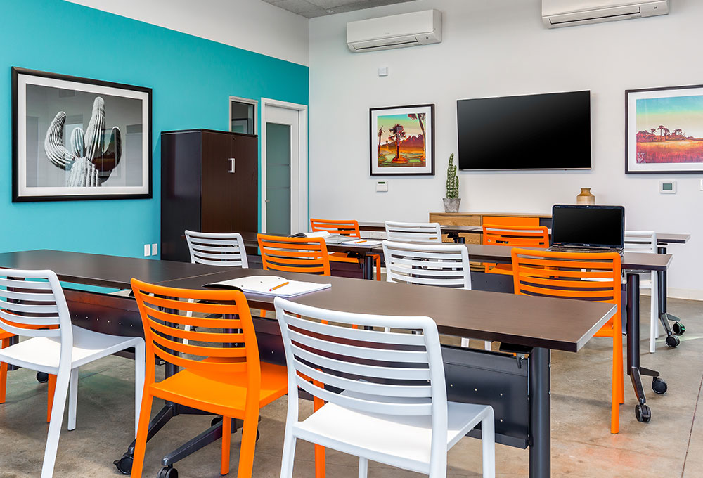
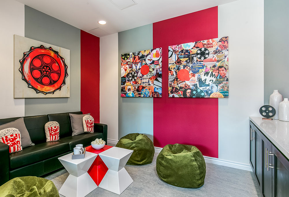
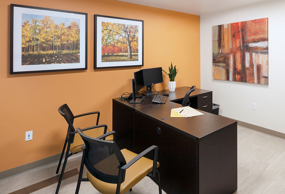
- Visual Stimuli: One of our specialties is knowing how to use color, texture, layering and patterns — in accent paint, artwork and murals — to inspire joy, promote relaxation, add interest and create a sense of depth in common spaces and seating areas.
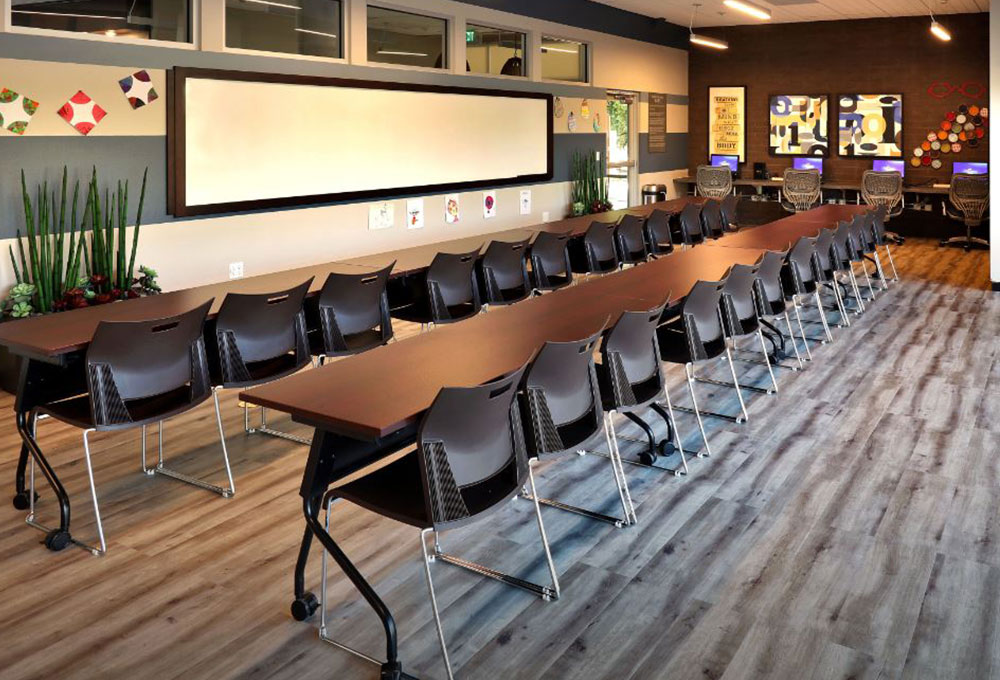

- Acoustics: Reduce noise in conference rooms, offices and community areas with soft materials like carpet, plush furniture, fabric wrapped panels or columns, and ceiling tiles.
TIP: In addition to noise-reduction, acoustical panels provide opportunities for decorative graphics.
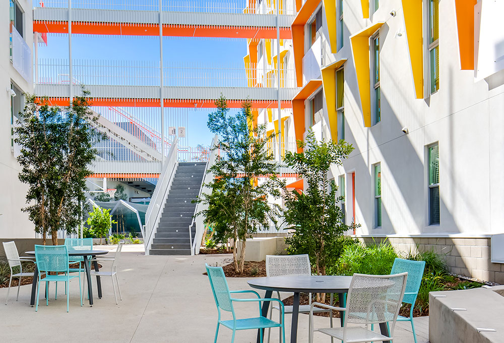
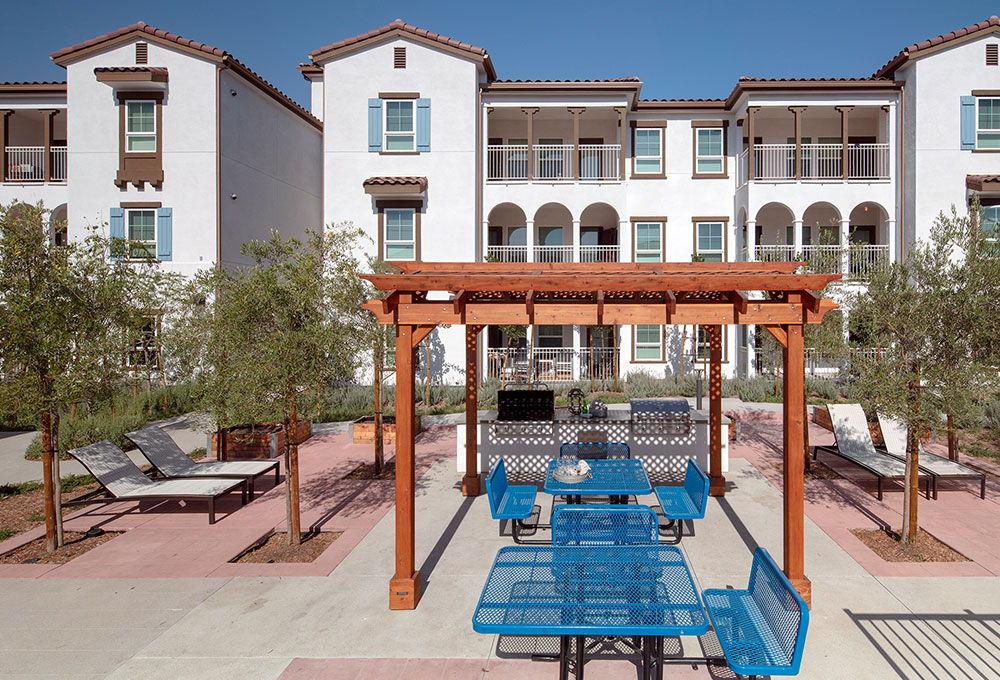
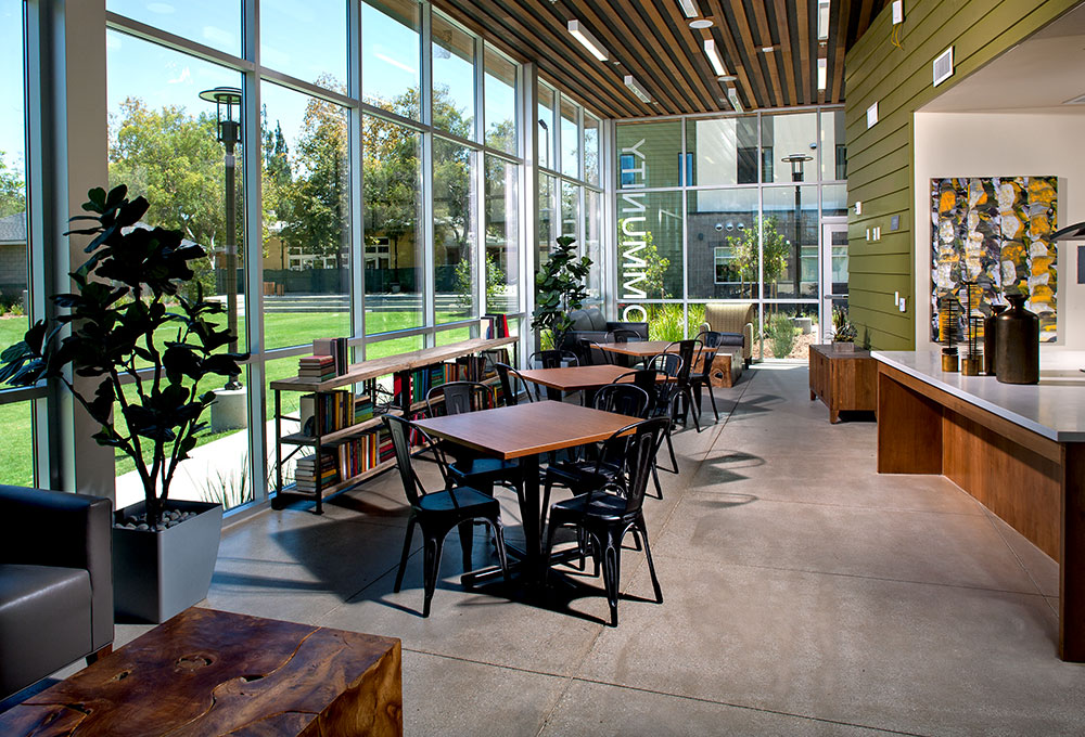
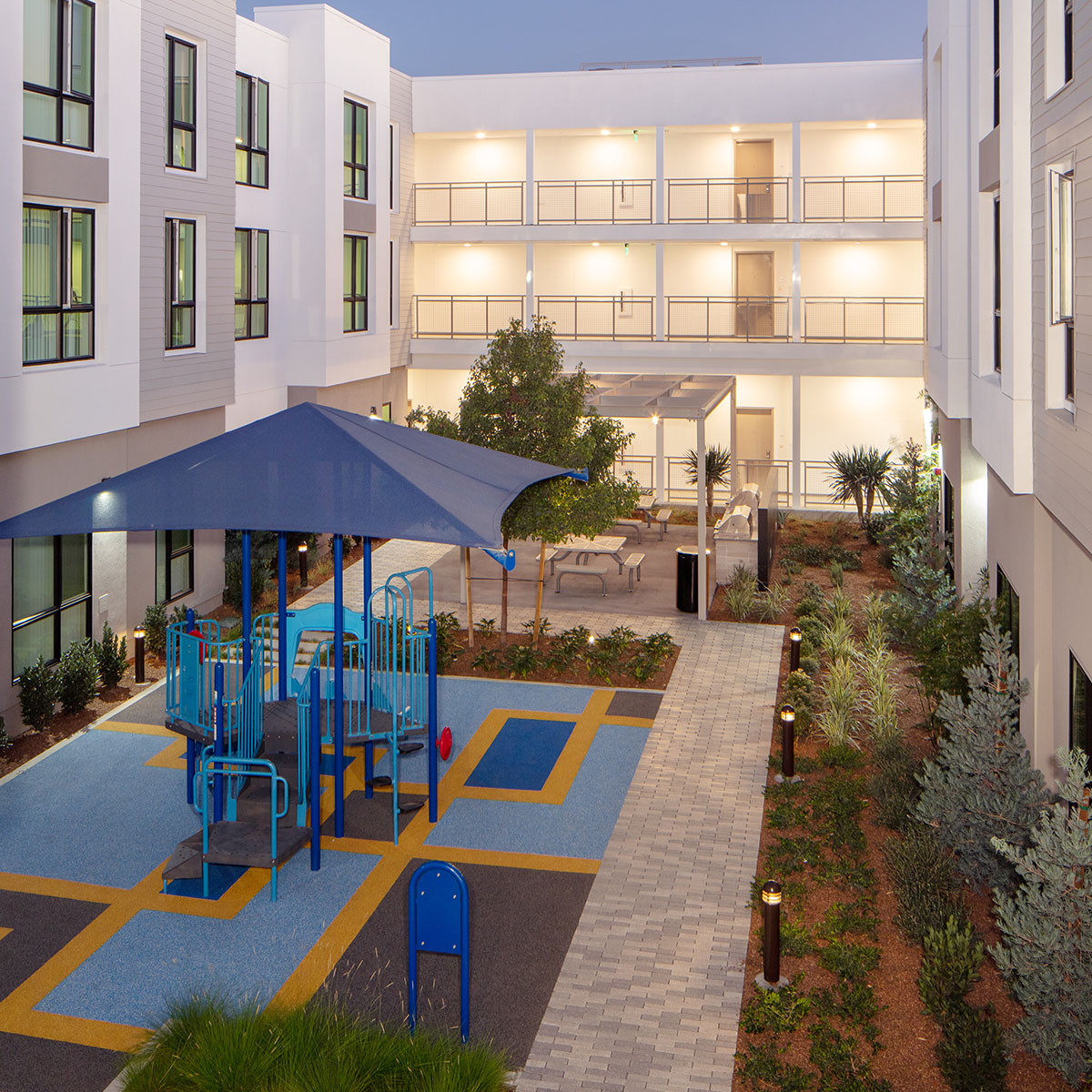
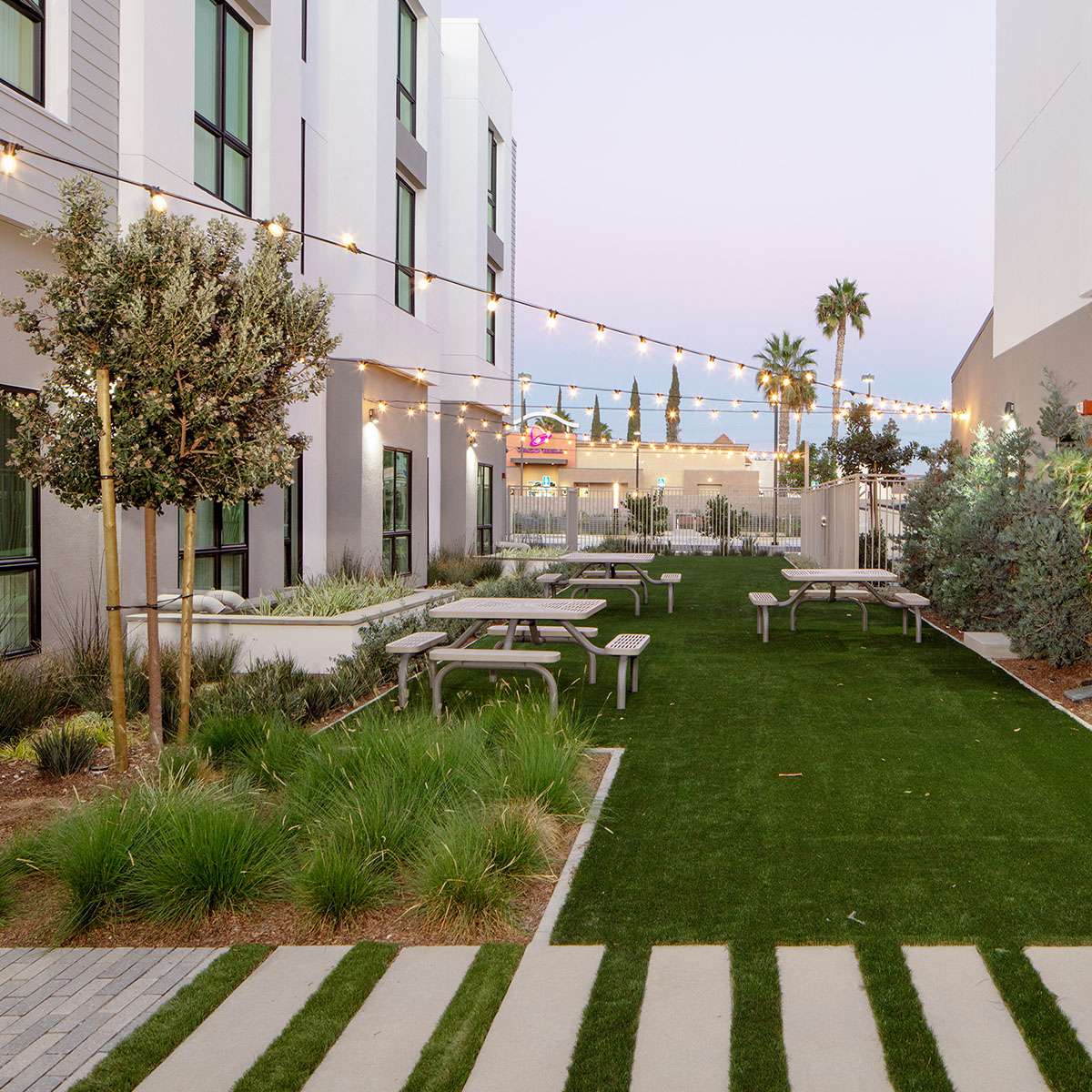
- Get Back to Nature — Inside and Out: Biophilic design incorporates natural elements — such as indoor plants, scenic photos or illustrations, wood or stone accents, and views of foliage from windows — to reduce stress and aid healing. Access to fresh air and sunlight in outdoor seating areas also combats depression and anxiety.
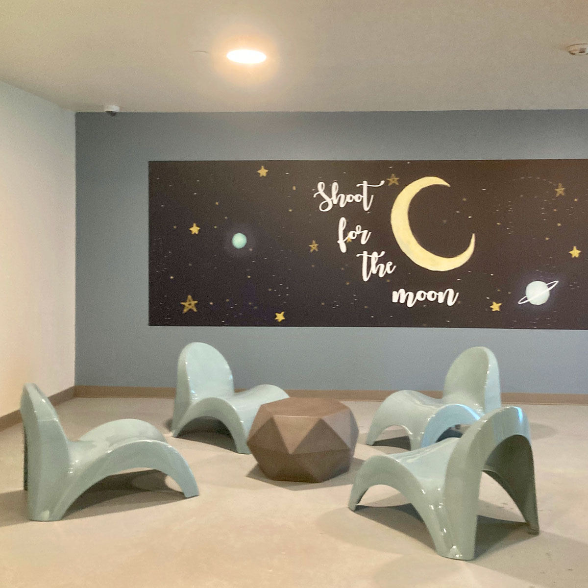
3. MOOD-ALTERING HUES, TONES AND SHADES
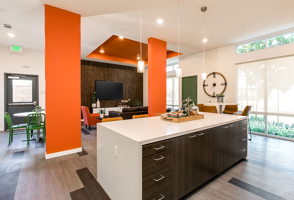
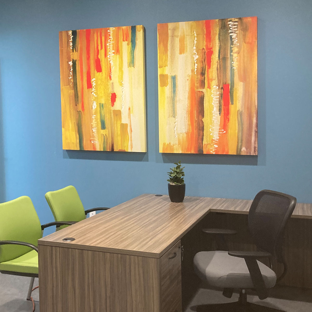
Color — on walls, artwork or furnishings — can affect our mood, make environments more relaxing and promote healing. According to Trauma-Informed Design for Homeless Populations — a comprehensive report from global design, architecture, engineering and planning firm HOK — warm colors like red, orange, yellow and purple evoke feelings of optimism, energy and joy. On the flip side, they can also signal danger and create feelings of anxiety. Cool colors like blues and greens help people feel calm and relaxed — but excessive use can make them feel sad. So, choose your shades wisely!
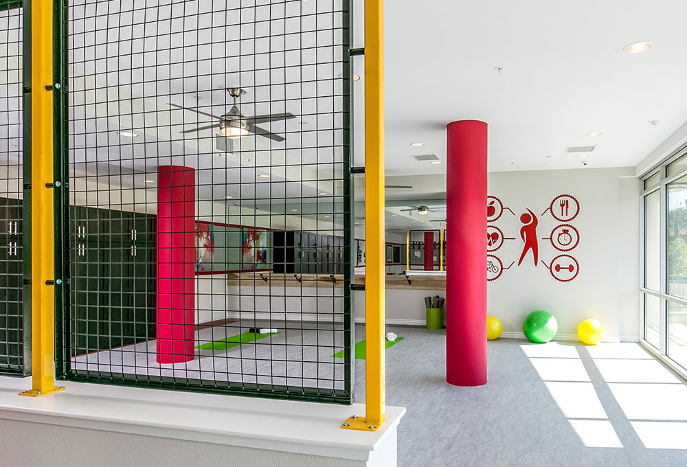
- Red: Creates energy, induces vitality, alleviates depression and stimulates appetite, but may also elevate blood-pressure and increase adrenaline. Use it in moderation.
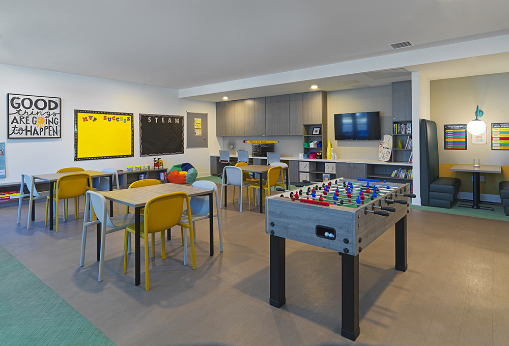
- Orange: Radiating warmth and happiness, this cheerful, healing color can be used in greater quantities than its core components of yellow and red. A great choice for children’s areas.
- Yellow: Evokes feelings of joy, stimulates intelligence and inspires creativity. Can also overstimulate, so use sparingly.
- Green: Calming, natural, balanced and motivating. Associated with growth, renewal and feelings of hope, green is a safe choice for creating relaxing and receptive areas.
- Blue: Evokes feelings of serenity and peace, can lower heart rates and blood pressure. Overuse can create the “blues” — leading to feelings of despair and depression.
- Pink: In addition to romance and femininity, pink also supports creativity. Lighter shades can be calming and stimulate happiness; darker tones deliver energy and excitement.
- Purple (including lavender and violet): Enhances imagination and insight. Lighter shades can be calming — similar to orange — and darker hues share properties with blues.
Tip: Warm and cool colors should be offset with neutrals, e.g., use a bright color on one wall and light gray, off-white or beige on the others.
ADDITIONAL RESOURCES
- Homeless in America (New York Times)
- Homeless Population by State 2022
- 2020 Annual Homeless Assessment Report to Congress (AHAR)
- Data and Statistics on Homelessness (National Center for Homeless Education)
- Envisioning a Trauma-Informed Service System: A Vital Paradigm Shift (By Roger D. Fallot, Ph.D. and Maxine Harris, Ph.D.)
- Creating Cultures of Trauma-Informed Care (CCTIC), A Self-Assessment and Planning Protocol (By Roger D. Fallot, Ph.D. and Maxine Harris, Ph.D.)
- SAMHSA’s Concept of Trauma and Guidance for a Trauma-Informed Approach (U.S. Department of Health and Human Services, Substance Abuse and Mental Health Services)
- Maslow’s Hierarchy of Needs (By Saul McLeod)
- Innovations in Implementation of Trauma-Informed Care Practices in Youth Residential Treatment
- How Trauma-Informed Design is Incorporated Into Supportive Housing
- Trauma-Informed Design (By Shopworks Architecture)
- Design Resources for Homelessness (Irene Winifred Eno Grant Research Project)